Email Unsubscribe Done Wrong
Posted in Websites and Hosting on February 2, 2026There’s nothing more frustrating than having issues unsubscribing to emails from companies, websites, or services you no longer are interested in. In this article, I discuss some of the most common user experience failures when it comes to unsubscribing from marketing emails and newsletters.
How hard can we make it to even find the unsubscribe link?
You’ll encounter this first issue before you’ve even done anything. You scroll to the bottom of the email for that unsubscribe link, and are faced with several paragraphs of tiny gray text on a white background and now you have to read for five minutes to find the right link to unsubscribe.
Who are we kidding? Nobody is going to do that – they’ll give up in about five seconds and just mark your email as spam, which is very bad for your brand’s email deliverability.
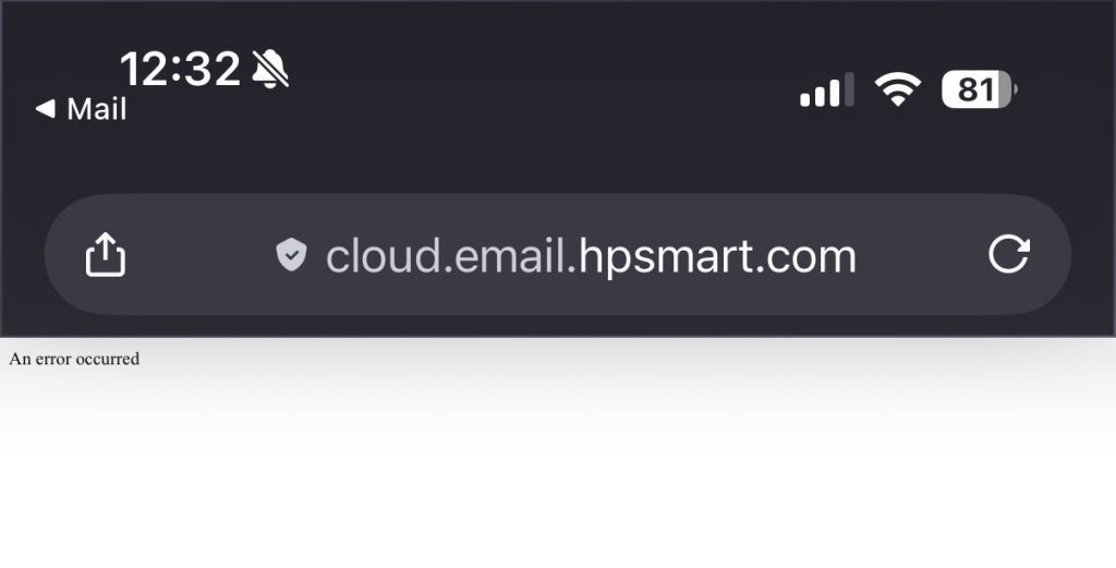
Here’s an example of HP’s email footer. Good luck!
Oops, you’ve encountered an error!
Let’s discuss HP again. Sorry guys, you really do a bad job with this. So, you finally find the unsubscribe link, click on it, and get an error.
Seriously, your company has a $19B market cap and your email unsubscribe link hasn’t worked for months. See for yourself! Despite the web address, I don’t think that’s very smart at all.
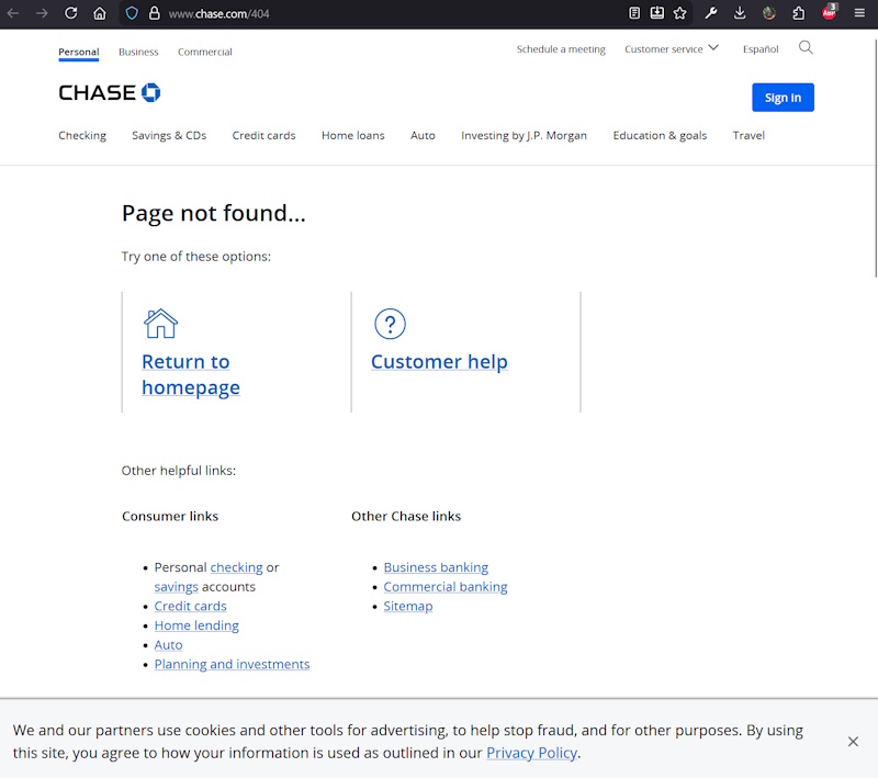
HP isn’t the only guilty party. My vehicle lease is through Chase, but I didn’t want to get any further offers for their other services, so I tried to unsubscribe. 404!
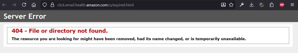
Fine, maybe it’s just bad luck… nope, here’s one from Amazon! See, this isn’t just an isolated issue, it’s a major problem across various industries. PS: Amazon, why are you using Windows Server!?
What’s my email again?
You know my email. After all, your marketing email is already personalized with my name, number of rewards points, and whatever data you use to determine what products I’m interested in. So why on earth can’t your unsubscribe link pass my email to the server? I mean, it’s technologically possible – many sites and services do implement this correctly.
But those that don’t do it for one simple reason, and it’s not incompetence – making it difficult for you to unsubscribe is beneficial for them.
You might be curious why it matters – surely typing your email only takes a few seconds? Well, if you have more than one email (like most of us do), it’s not always that simple. The way most email clients work, it might not immediately be obvious which email address you used to sign up for whatever you’re trying to unsubscribe to.
So, either you try a few random email addresses and guess right, or you just give up, go back to your email, and mark it as junk. The lesson is, either the unsubscribe link should directly perform the unsubscribe action, or at the very worst, if you are going to have a form where they have to put their email in, prefill the correct email so the user just has to hit the submit button.
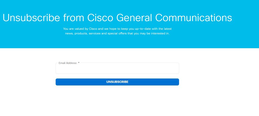
This is funny… as I was writing this article, I got a marketing email from Cisco, and attempted to unsubscribe to it. And yep, here’s a perfect example of the unsubscribe link in the email going to a form, where my email is not populated automatically.
Welcome to checkbox hell
User interfaces might look simple, but doing it right isn’t. Thankfully, despite design trends evolving over time, there are a few things that continue to frustrate – and that’s sliders and checkboxes in ambiguous ways.
The lesser of three evils is when the styling is too subtle so that you don’t know whether it’s checked or on or whatnot, but simply toggling it once or twice usually makes this not the end of the world.
The next potential problem is when there is not one button or checkbox to just unsubscribe to everything. If you have to tap or click half a dozen things to stop receiving email, that is wrong. Or, even if you do have that, it’s way after a long list of stuff.
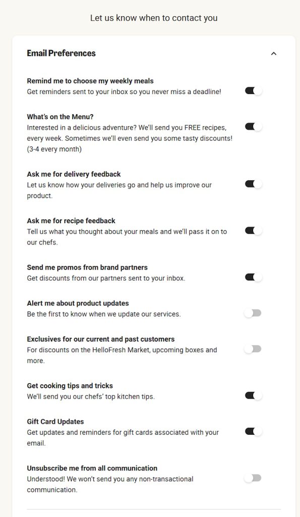
What’s really bad though is when you don’t know if checking the box or turning on the slider means you continue receiving the emails, or unsubscribes you. That should be instantly obvious, and I shouldn’t have to carefully read the page to figure it out. “Check the box to select which emails to unsubscribe from” or “Uncheck emails you don’t wish to receive anymore” isn’t good enough. Be consistent. Be clear. And don’t be like HelloFresh, where turning on represents you receiving the emails, except the last item of unsubscribe to all represents not receiving any emails.
You’re using a smartphone in 2026?
Mobile versions of websites have been a thing since 2007 when the iPhone first came out. Responsive design has been the industry standard since the Bootstrap framework came out in 2011, and mobile-first web development is now the name of the game.
So if I’m on a smartphone and go to your unsubscribe link and the page is broken on my mobile browser of choice, or I have to play with zoom or rotation to be able to unsubscribe, you’re doing it wrong.
Surely you test what you make? You already have a computer or phone to test your own stuff, Mailchimp has powerful testing tools, and BrowserStack has a free trial. In 2026, I shouldn’t even have to explain this to you.
Departing customers matter, perhaps more than anyone else
You can have the best products or services in the world, but what’s most memorable in a customers mind or what they’re most likely to discuss with friends and family is not when everything is perfect, but how you treat them when they’re trying to move on. Whether it’s unsubscribing for an email, they’re cancelling a subscription, or making a return on a physical product, it’s critical that you make the user experience easy for people that aren’t fully satisfied. After all, look through Yelp or Google reviews – even the best businesses in the world don’t have a perfect 5.0 rating.
In Conclusion
If you send your users or customers emails, be sure you give them an easy out. Not only does it annoy people, proper email deliverability is insanely complex, and just a few people marking your messages as junk to their email provider can throw a wrench in what you’ve worked so hard for.
In this article we explored just a few examples of how not to do email unsubscription links. Hope you found it interesting, and if you send your customers emails, go test your process right now to make sure it’s easy for your users to unsubscribe.